The data says yes!
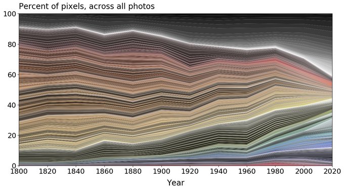
You may have seen the below graphic floating around your social media pages recently, backed up by some pretty bleak examples of just how ‘beige’ the world has become. From car models to interior paint choices, we have gone from living life boldly to conforming to neutral norms.
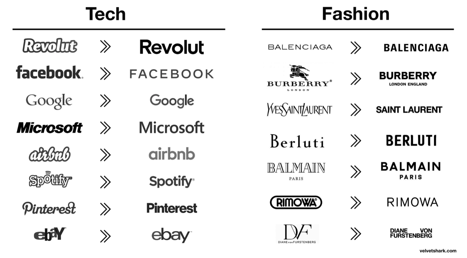
And it’s not just colour we’ve seen disappearing. It’s distinctiveness. Have you noticed how similar the visual identities for some of the biggest brands in the world have become recently?
We’re not advocating for bubble fonts to make a comeback 😮, but to build brand equity your visual identity needs to be a unique expression of what you stand for, whilst also keeping one eye on the trends to stay relevant. So what’s next in the cultural zeitgeist and how can brands stand out in the sea of sameness? We’ve got a few ideas!
Brands are tapping into nostalgia
The pandemic has got us nostalgic for the ‘good old days’. In an industry that is relentlessly fixated on the new, there is comfort in looking back and tapping into life pre-pandemic, a time that felt safer and more enjoyable.
Many fonts and design elements have recently taken inspiration from 80’s, 90’s and 00’s references. Off the back of the more simplistic design executions we have seen in recent years, it’s no wonder we are seeing the resurgence of bold designs and tapping into the past. Hurrah for brave brands! One of the largest trend predictors, Tik Tok, has amassed huge views on high school footage from the 90’s and even the Super Bowl this year was littered with old-school references from Wayne’s World and Austin Powers to Edward Scissorhands.
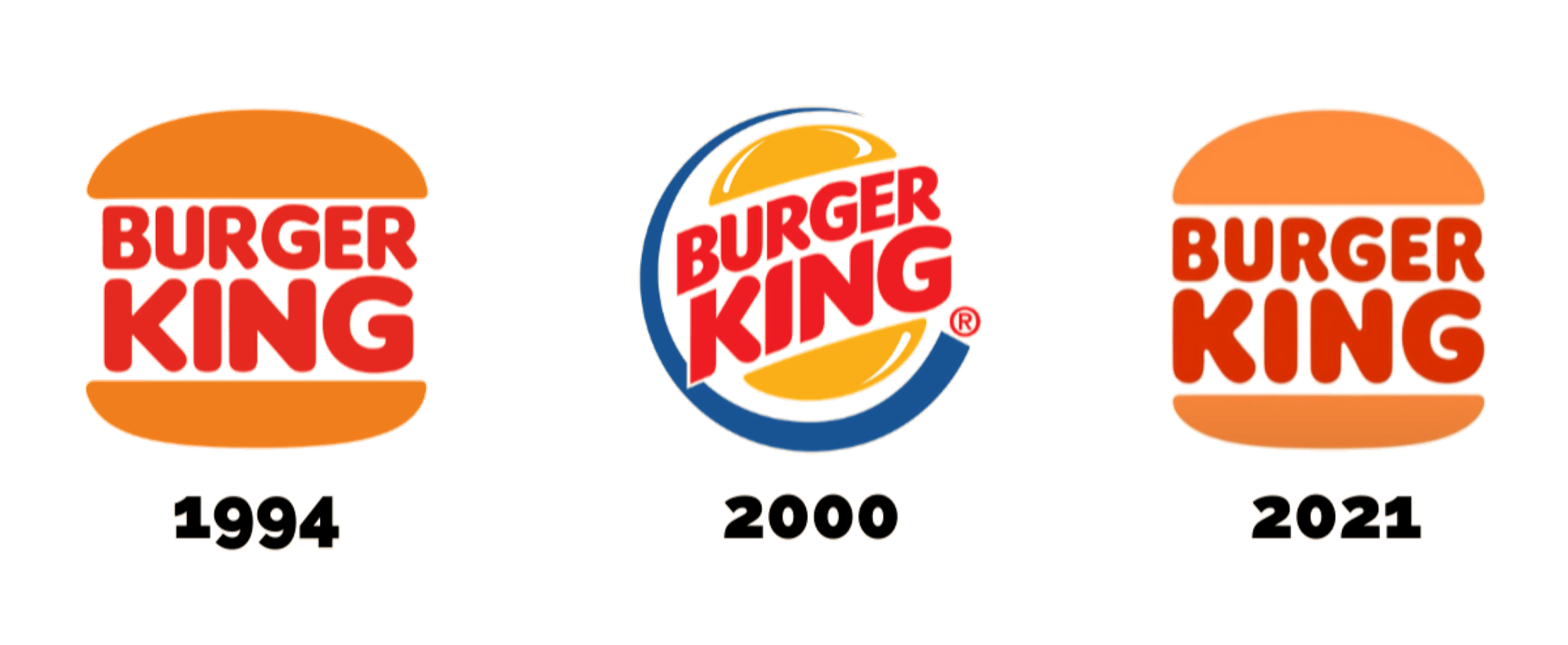
Brands are going back in time too. Burger King has recently returned to a variation of a former fun 70’s logo, VISA has brought back their brown and blue twin stripe and Caltex has reverted back to their retired Ampol branding.
Nostalgia may be seen as the new cool kid on the block, but is it for you?
“F*$K it! Let’s have fun!”
Colour is one of your most powerful tools to evoke emotion and connect with your audience, so it’s no surprise that post pandemic, bold colours are having a resurgence.
Enter ‘dopamine dressing’. A trend that promotes dressing and living in a way that brings you joy and boosts your mood. Vivid, bold and saturated colour is in, and here to stay, helping us feel upbeat and optimistic as we emerge from the pandemic blues.
Psychologically, colour affects us all, and has subtle and not so subtle effects on how we feel. Red often equates to urgency or love, blue brings a sense of calm, green links to the environment and yellow evokes a sense of happiness. With this in mind, the impacts are often overlooked from a marketing perspective. It’s safe to say choice of colour can completely change the way people can feel about you or your brand.
These choices matter and can become key elements of who you are as a brand and what you stand for.
Standing out in your sea of competitors is a must, but do it authentically.
To avoid jumping on the trend bandwagon, go back to your past to find those hidden gems of why you started. Also look at your current brand foundation, your purpose and values, and use those as inspiration for how your brand should evolve (or not) in future.
Most importantly:
Find the sweet spot between those two and you’re killing it – a strategic position on which to build a relevant, unique and authentic brand. 🤙
Sources: